April 3, 2022
Year
2023
Client
CBDKING
Category
Product Duration
1-2 Weeks
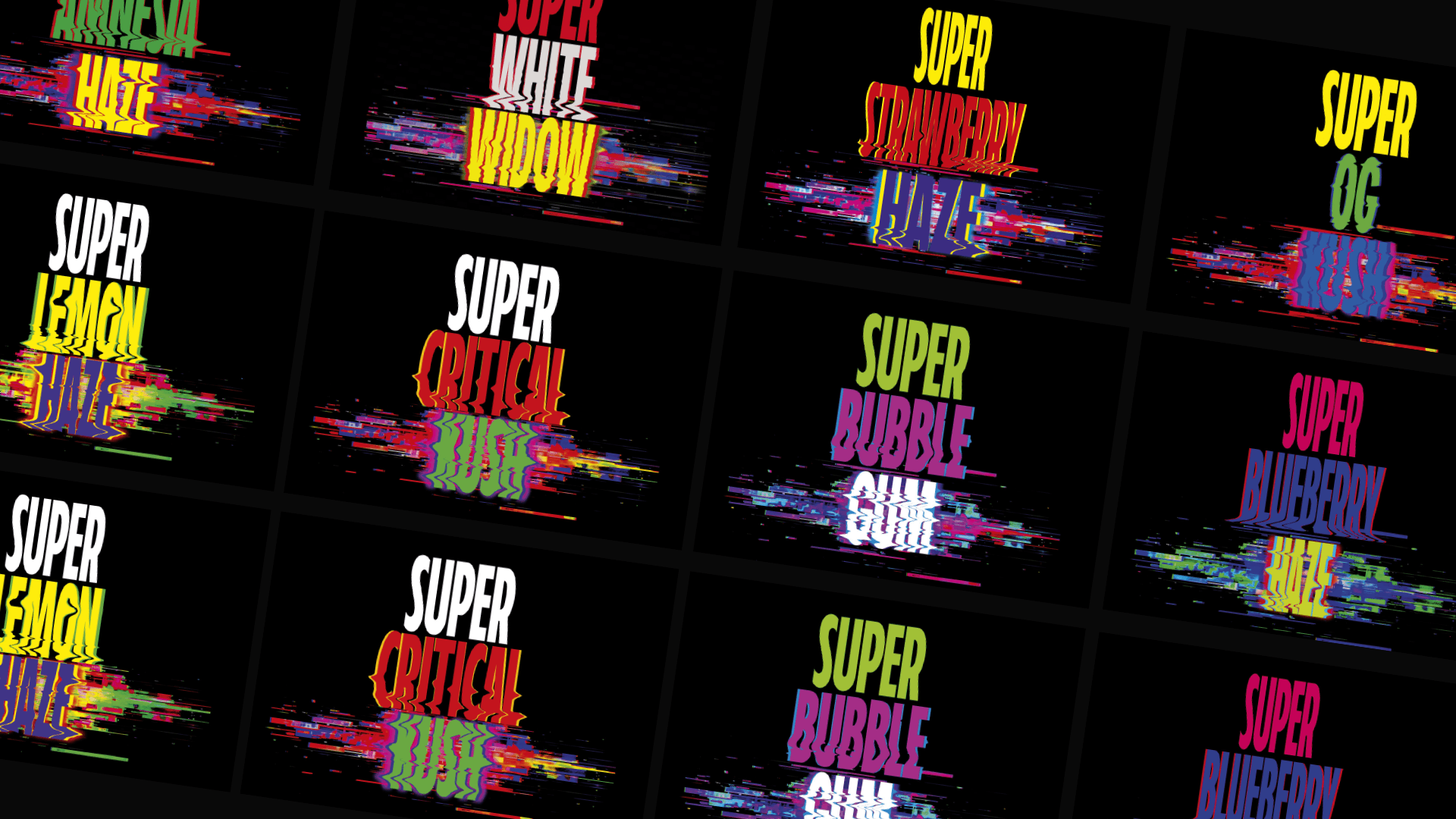
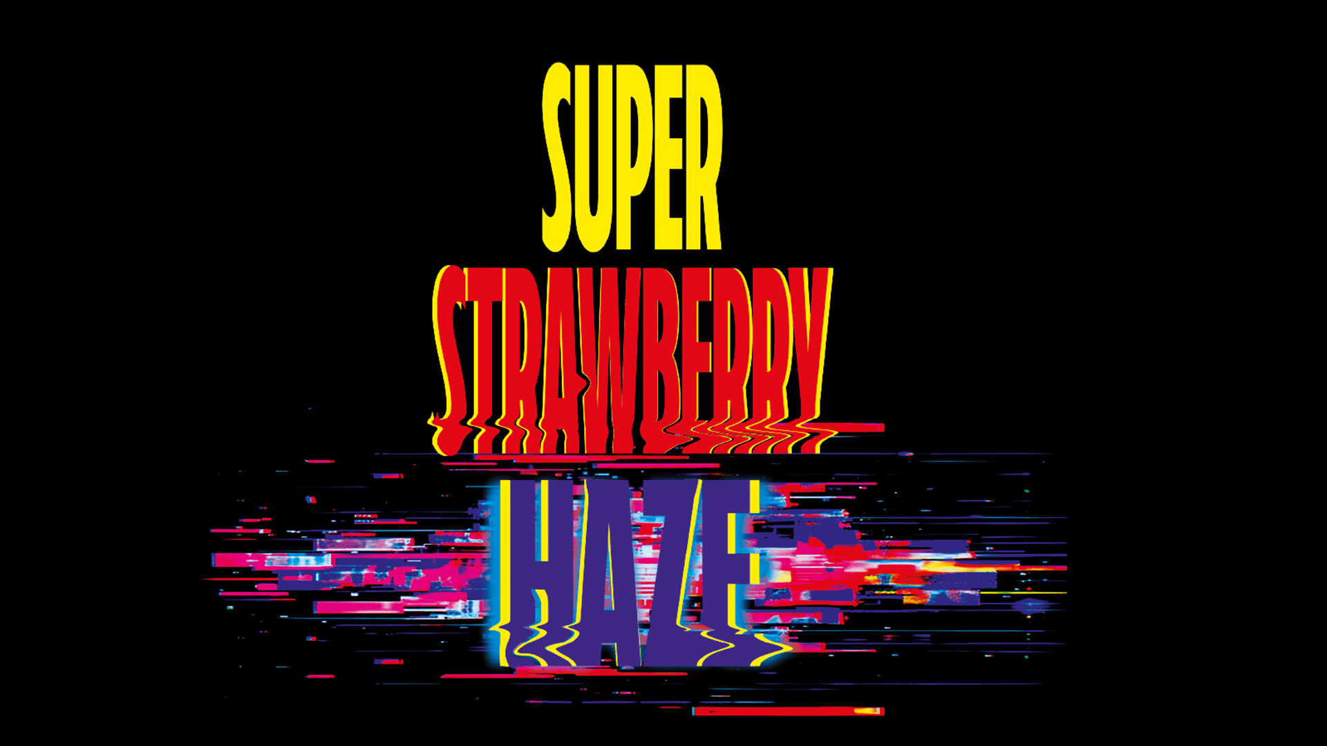
The GLITCH series is built around a custom-driven typography system where controlled distortion meets high-contrast color theory. I developed a unique visual language that pushes aesthetic boundaries while strictly adhering to technical legibility and market compliance. Every "glitch" effect was engineered to remain crisp and impactful across various print substrates, ensuring the brand's edgy personality doesn't compromise its regulatory requirements.
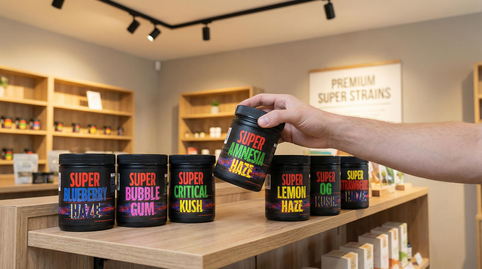
A systematic approach to a high-volume product family. I designed a scalable architecture that allows for rapid SKU expansion through a logic-driven color-coding and flavor-mapping system. By implementing a modular "master-template" workflow, I ensured that even with complex distorted graphics, critical technical data—such as barcodes, EAN placement, and legal warnings—remains perfectly positioned and error-free across the entire range.
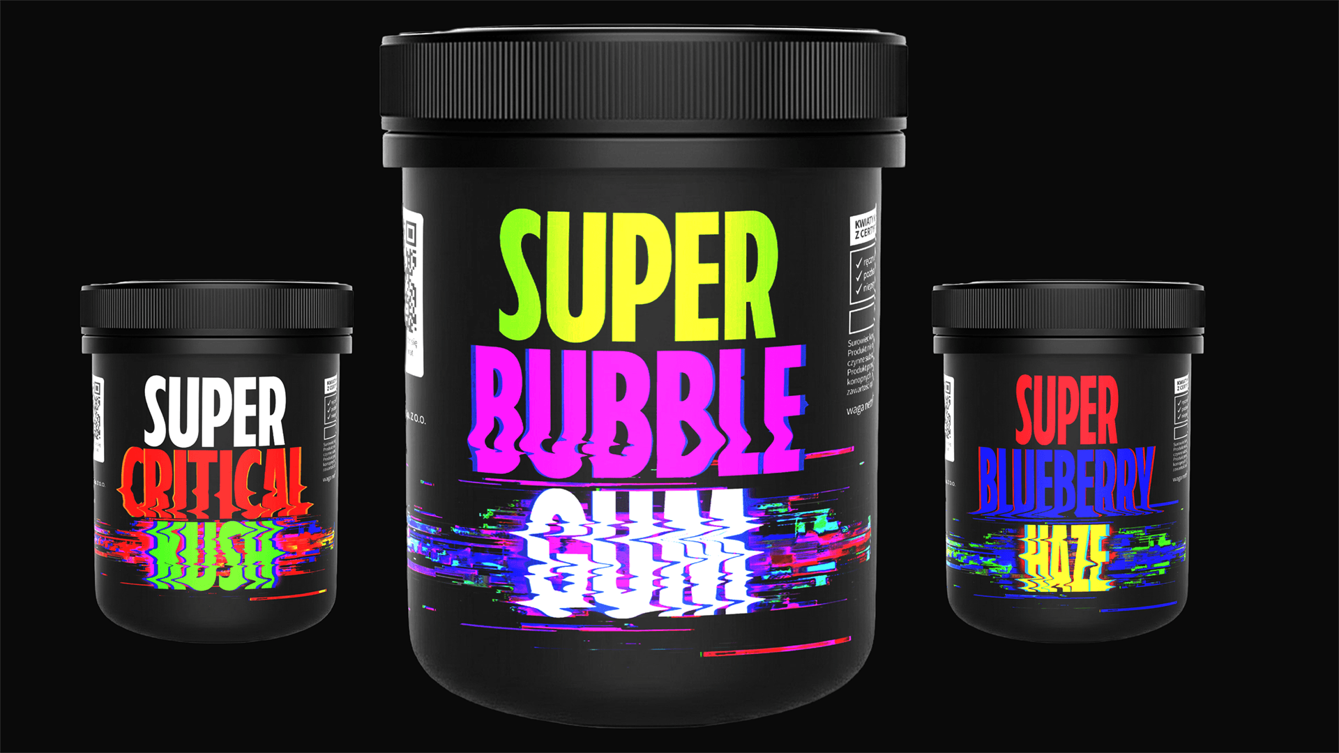
High-fidelity 3D visualizations developed to bridge the gap between digital previews and physical production. These assets were built to provide studio-quality packshots for e-commerce listings and distributor sales decks. By utilizing advanced lighting and texture mapping in Adobe Dimension and Photoshop, I created a consistent visual standard that accurately represents the product's finish, enhancing shelf appeal in a digital environment.
The final lineup demonstrates absolute brand consistency across multiple touchpoints. From the initial creative concept to the final vendor-ready handoff, I managed the end-to-end production process. This includes precise dieline management, overprint/knockout checks in Acrobat Pro, and ensuring that the high-contrast glitch aesthetic translates perfectly from screen to shelf-ready physical packaging.